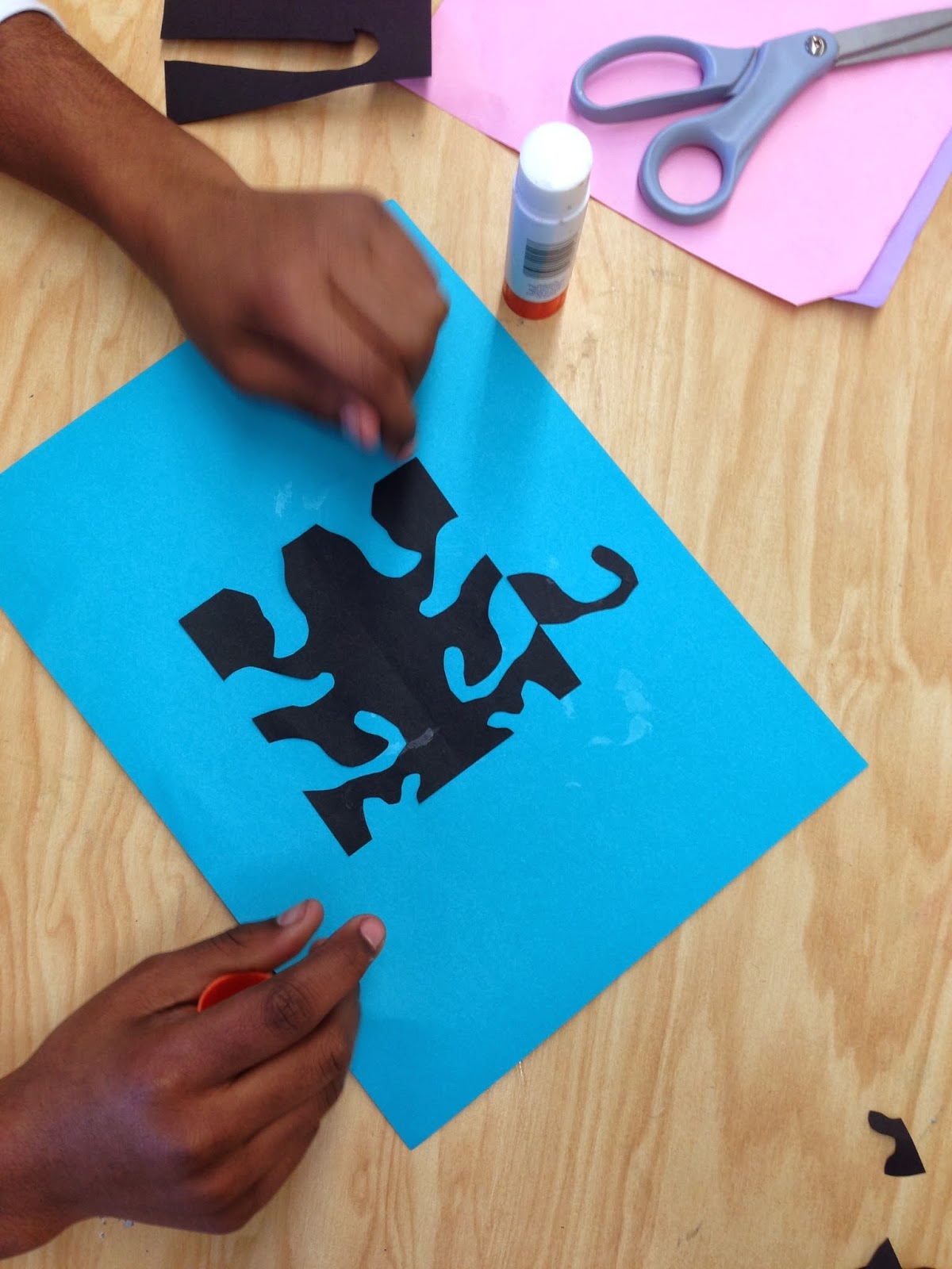
The 6th graders learned about the Japanese art of Notan. The word notan means contrast in Japanese. The students chose two pieces of paper in contrasting colors. We made our notan symmetrical but all notan does not have to be symmetrical.
Here are some photos of in-progress work:
I cut small squares and provided larger 9"x12" paper for the background. I would have liked to be able to cut from larger squares but for some reason silly me didn't order larger paper for the background paper and so we had to use 4"x4"squares so the designs would fit on the 9"x12" paper for the background. The background paper has to be considerably larger than the square for the whole design to fit. Oh well. Next year I will know to order 12"x18" paper for this project!
I will post photos of finished pieces later!
Pepsi Can Designs
I have these Pepsi cans that I saved from the 1990's. I have always liked the designs and thought that this could be a good lesson on graphic design.
The 5th graders are introduced to graphic design and we discuss what it is and how it can be persuasive.
The assignment is to create a new Pepsi can design that has the them of a season, holiday or event.
The designs must be completely colored and have the Pepsi logo somewhere in the design.
We saved soda cans to wrap the designs around and they are secured with tape.
Frank Stella Inspired Masterpieces
The 5th graders and I take a look at some of Frank Stella's paintings. We talk about how they are partially 3-dimensional and that he bases them on experiences he has had and things he has seen. This is 'Record for an Exotic Bird' 1978 by Frank Stella. I ask the students to point out shapes and colors that reference an exotic bird. It is amazing how sometimes I learn from my students!
For the assignment I tell the students they will be creating a Stella-inspired creation based on one of their own experiences. I encourage the students to choose an experience they have had or something they have seen and take shapes and colors from that experience to make a design.
 |
| The students choose a background of wall paper for their painting. |
 |
| They cut the wall paper to fit their tag board and glue it in place. |
 |
| The next step is to choose pre-cut foam core pieces. The pieces are pre-cut so the students have neat edges. I explain that they are to choose shapes that they want. The pieces all have straight lines, so if they want curvy lines in their art work this can be added by drawing and painting later. |
 |
| After the pieces are selected the students arrange them on the background and glue them into place. |
 |
| Next the students go to town with drawing patterns and adding a lot of bright colors. I tell the students that they can use as many colors as they want and they should create many patterns and designs on the pieces because Frank Stella uses bright, bold colors and many patterns and designs. |
 |
| For the last step I put a different color of neon tempera paint on each table an instruct the students to add a few accents of neon colors. The students are free to move to the tables that have the colors they need. I encourage them not to over-paint their paintings and that the neon paint is just for accents. |
 |
| I love these because of all of the bright colors and they are so fresh and playful! The fact that it just took two class periods to complete this project is also a plus! |
If you enjoy this blog please follow me!